Teardowns › Homepages & product pages › Friction (principle)
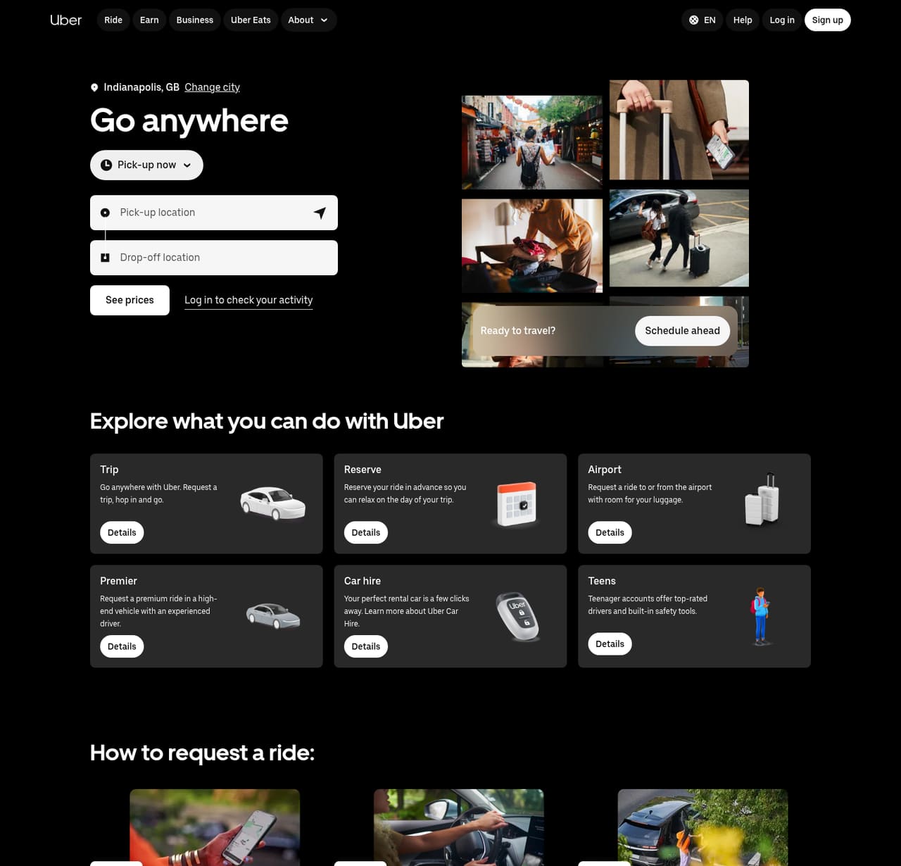
Uber lets you "See prices" before you sign up
The psychology
Why it nudges
Starting with the task (where are you going?) instead of an account form removes friction. "See prices" is a plain label for the next step, so the first click feels like getting a quote, not committing. Whether this lifts sign-ups for Uber is not public.
● Strong evidence · More on friction (principle), with sources →
Context
A ride-hailing app whose website pushes people into the booking flow or the app.
Honest nudge or dark pattern?
Honest nudge
Honest nudge, provided the prices shown are the prices charged.
Steal this, honestly
- Let people start the task before asking them to create an account.
- Label the first button with what they get ("See prices"), not what you want ("Sign up").
What to test: "See prices" vs "Request now" on the hero button. Measure quote views and first rides.
Next: run it on your product
Apply this with your agent
Take the steps above into your own flow. The prompt carries this teardown, the honest-vs-dark line and the steps.
ChatGPT, Claude, Grok and Cursor open with the prompt filled in (it is also copied, in case the prefill doesn't load). Gemini and Codex don't support prefilled links, so the prompt is copied and the app opens; paste it in.
Sources
- Our capture of uber.com, 16 Oct 2026
- Behavioural Insights Team (2014), EAST: four simple ways to apply behavioural insights. www.bi.team/publications/east-four-simple-ways-to-apply-behavioural-insights/
Related teardowns
5 new nudges, every Friday
Five real product and marketing moments, the psychology behind each, and one thing to try. Weekly issues start soon. Your email is stored with our email provider (Resend) and used only for this newsletter.